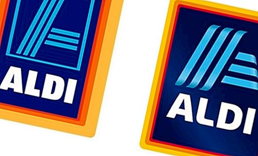
That's what the new Aldi Süd logo looks like

 © ALDI SOUTH
Now it's time again: A redesign of the brand logo must come from. The discount store retains the familiar color combination of red, blue, cyan, yellow and orange, but now the logo is three-dimensional. The fresh coat of paint stands for a "contemporary and sustainable appearance," says Communication Director Kirsten Gess.
The "principle of simplicity" that emphasizes Aldi's marketing strategy should also be reflected in the new logo. The light blue 'A' above the logo is still part of the logo, but will also appear as an independent element in the future.
When will the new logo be used?
In China, the discount store already uses the new logo. In all other countries, the revised logo will be gradually introduced from June 2017 onwards.
Incidentally, the logos have changed over time:
 © ALDI SOUTH


